Refreshing the KCATA Site with a New Responsive Design
We’ve talked before about responsive design and the need for websites to look good on a range of devices from full size monitors, to tablets, to smartphones. Until recently, we generally thought that for complex sites and catalogs, a mobile-specific, slimmed-down version of a site that was easy to navigate and quick to respond was still the best approach.
But as web technologies evolve, we’re constantly re-evaluating our processes. The availability of high-quality grid frameworks like Bootstrap and Foundation have provided us with powerful new development tools. And the capabilities of modern web browsers, including those on mobile devices, made us firm believers that responsive design is the most efficient and effective way to support website users across multiple devices.
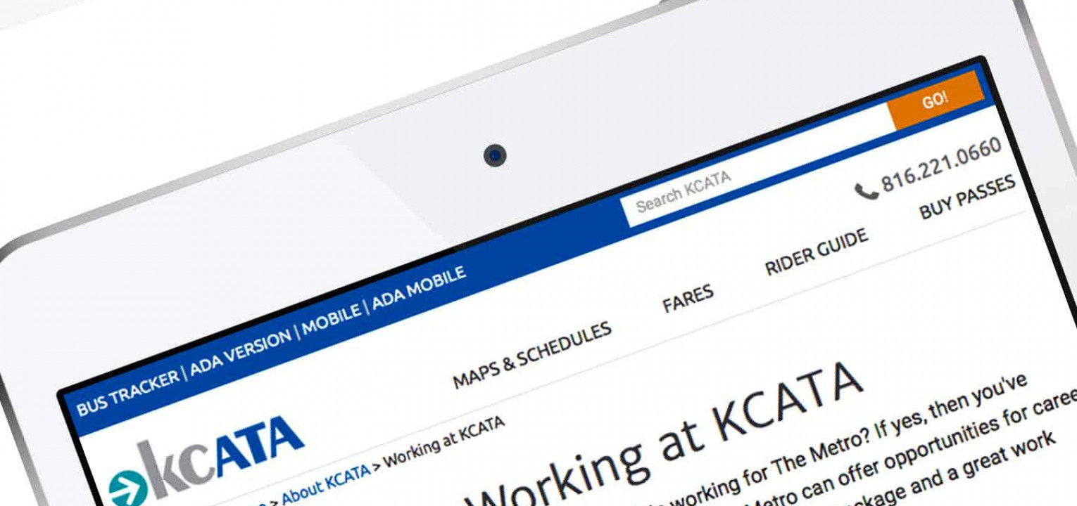
Today we’re excited to announce that we’ve launched a refresh of the KCATA site—the website for the Kansas City Area Transportation Authority—with a fresh look and feel, and a responsive design. We’ve made the site faster for users and added flexibility so that the site adjusts to whatever platform the user is visiting from. That means the site automatically presents the best display for different sized monitors, so users can use the site without too much scrolling and resizing.


We think KCATA users will find the refreshed site much easier to use, with a clean, uncluttered appearance, and with the route finder right up front, where it’s hard to miss. We’ve also simplified the main menus at the top of the site, but provided direct links to the pages users look for most often at the foot of the page. On smaller devices, the responsive design makes the most of the small screen size and minimizes the distractions, helping users find what they’re looking for fast.
What this means for the sites we develop, is that there’s no more need for a mobile-specific site. Using the Foundation framework we can create beautiful, custom sites that are responsive and unique. Existing sites built on the application frameworks we often use: CMC3, ExpressionEngine, and ShopSite, can be refreshed—transformed, really—with a new look-and-feel and responsive design, just like we did for KCATA.
At Ebeacon we’re always looking for better ways of helping your customers find what they need from your catalog or website, whether that’s on their computer monitor, tablet, or smartphone. Check out our Services pages to see what else we can do to help your business thrive. Or, if you already know you need to refresh your site with a responsive design, contact us to discuss your project.